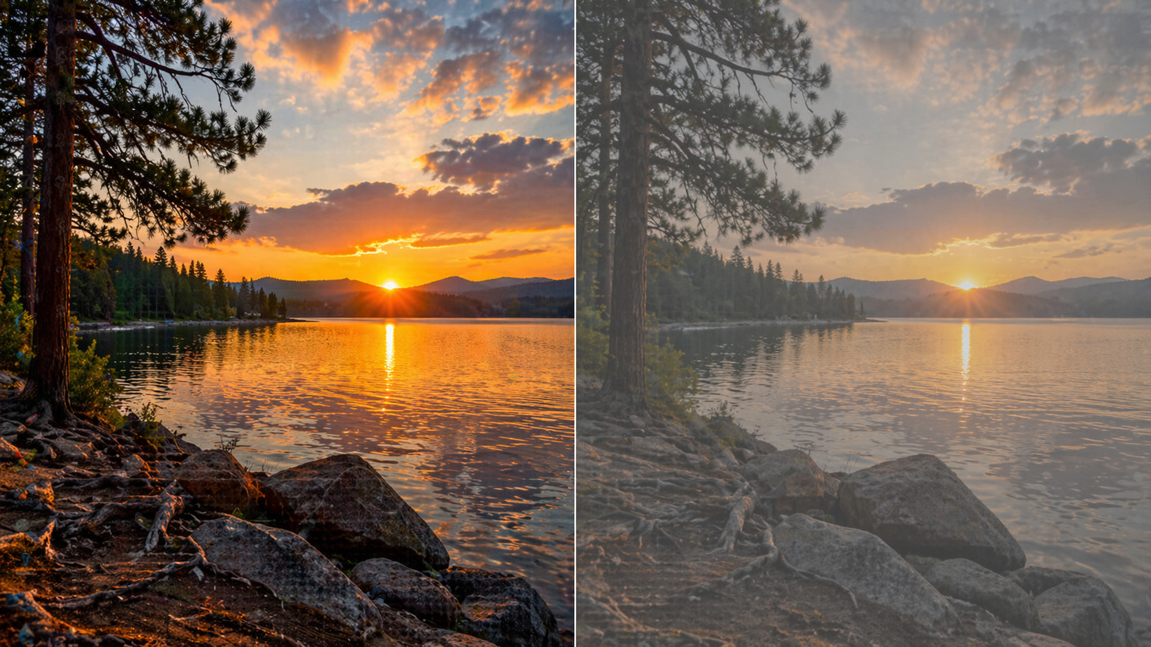
Photos look bright and rich on iPhone or Mac, but after editing they suddenly become dull and flat. This is not a bug and not a random issue. In most cases, the problem is how color is handled during editing.
Users often think they broke something in settings or exported the wrong format. In reality, the issue comes from color profiles and bit depth, which are usually ignored. If you don’t control them, color loss is unavoidable.
Main reason — wrong color space
Modern smartphones, including iPhone, capture images in Display P3. This is a wider color space with more shades and depth. But most editors and export settings still work in sRGB.
When a photo is opened or exported without controlling the profile, it gets converted to sRGB. Part of the color data is lost. That’s why the image looks less saturated.
- The original is captured in display p3.
- The editor or export converts it to sRGB.
- Some colors get clipped.
This is not always obvious at first, but the difference builds up. It is especially noticeable in bright or high-contrast scenes. The image loses depth and looks cheaper.
How to change color space in Affinity Photo
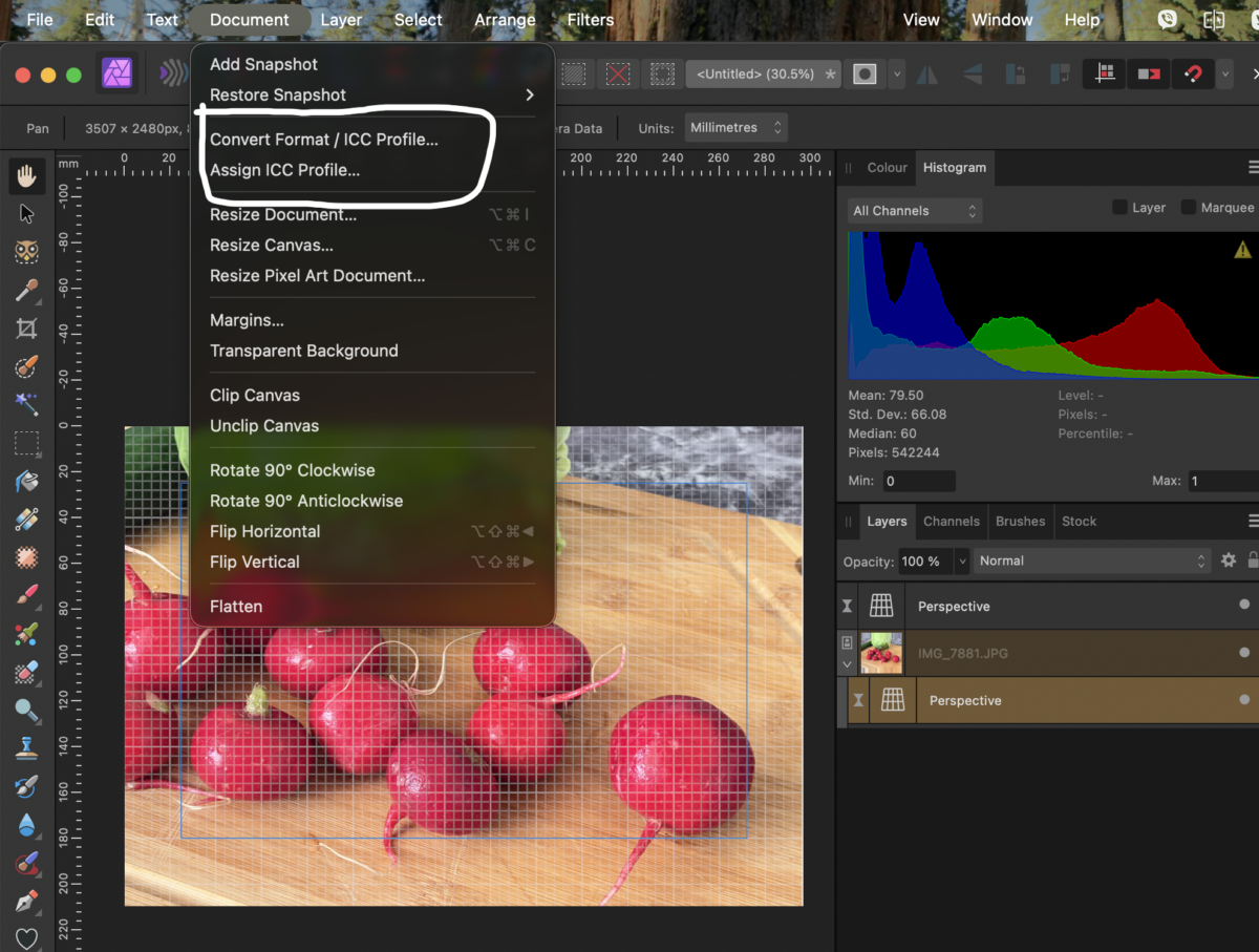
If the photo already looks dull when opened, the problem is how the app reads the file. Affinity Photo often assigns the wrong profile, especially for HDR images from iPhone. This must be fixed before any editing.
The correct path is simple, but it’s important to use conversion, not just assigning a profile. Otherwise, the colors will remain incorrect. This step directly affects the final result.
- Open the Document menu.
- Click Convert Format / ICC Profile.
- Select Display P3 from the list.
- Apply the change so colors are recalculated.
After this, the image changes immediately — color and depth return. If you skip this step, all further editing works on already broken color. That’s why this step is critical.
Second reason — low bit depth
Most images are processed in 8-bit by default. This is enough for standard photos, but not for HDR. In this mode, part of the image data is simply lost.
During editing, this leads to loss of detail in highlights and shadows. Smooth gradients become rough or dirty. Visually, it looks like reduced quality.
- 8-bit limits color information;
- HDR requires 16 or 32 bit;
- lower bit depth removes detail;
- the image becomes less deep.
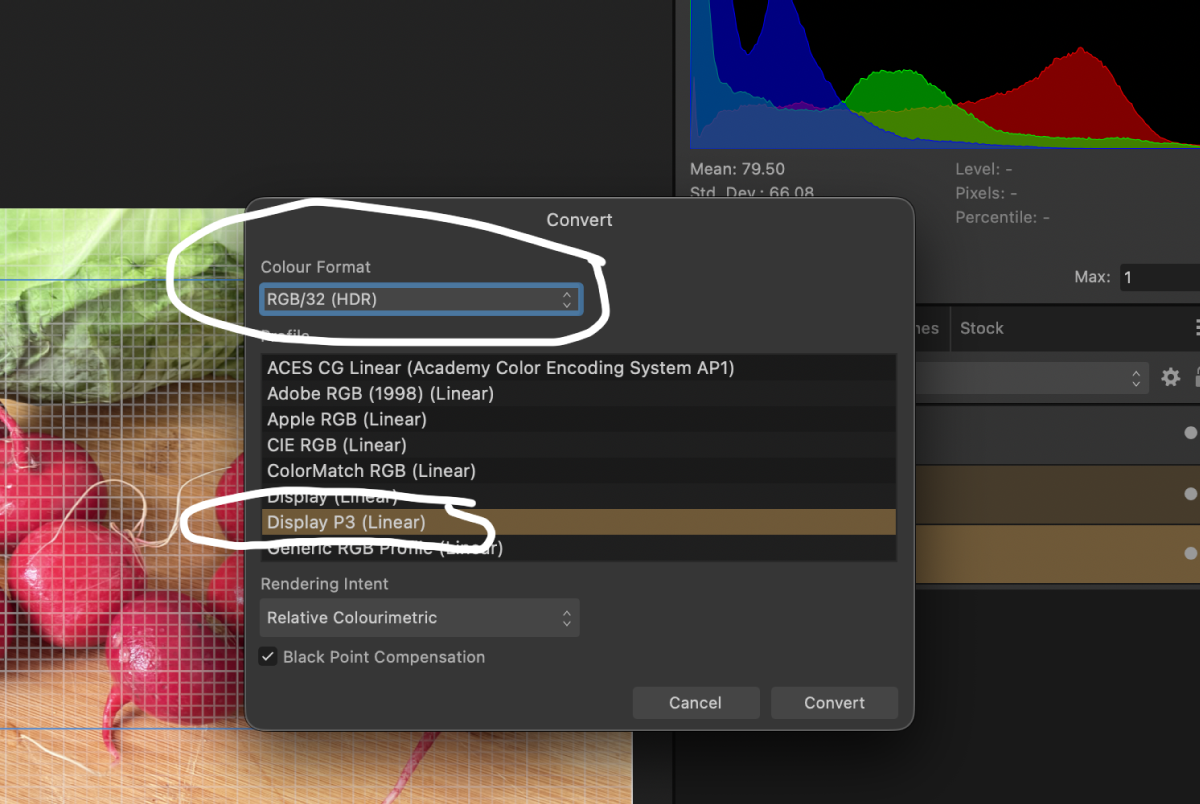
This is one of those problems that is hard to notice in settings but easy to see in the result. The photo looks the same, but worse. The reason is purely technical.
What happens during export
Even if you didn’t change anything manually, export can ruin the image. Many apps automatically optimize images for web use. This simplifies color and reduces data.
The result is a smaller file but lower quality. This is especially critical for HDR images. They are not designed for aggressive compression without preparation.
- The app changes the color profile during export.
- Bit depth is reduced.
- Some data is removed to reduce file size.
The user only sees the final result and doesn’t know where the loss happened. But it is already built into the export process. And that lost data cannot be restored.
Get breaking news on WhatsApp
How to avoid color loss
To keep the image identical to the original, you need to control the process. There are a few basic steps that solve the problem. They are simple, but must be applied every time.
If even one step is skipped, the result becomes inconsistent. That’s why the workflow matters. It gives predictable output.
- work in display p3 if the image was captured in it;
- use 16 or 32 bit during editing;
- check export settings before saving;
- avoid relying on automatic modes.
These steps don’t improve the image — they preserve what is already there. That’s important to understand. Proper control gives better results than any filter.
Color loss is a technical issue, not a problem with your camera or skills. Once you set up the correct workflow, the issue disappears. And your images stay consistent everywhere.
Більше новин в телеграмі